Increased conversions by optimizing UX design

Analysis, recommendations and quick wins that are easy to develop.
I analyzed homepage and product listing page of an e-commerce website, and proposed UX and UI solutions to increase conversions and boost sales and support SEO efforts.
My roles
UX researcher UX/UI designer
Timeframe
Jan 2025
Team
Individual project
Tools used
Figma
TL;DR
Homepage feels a bit overwhelming - there is a lot going on, yet the mention of the subscription feature is hard to find. I suggest toning it down (avoid using red), unifying elements (like arrow icons) and highlighting the subscription feature, as it might improve conversions.
Currently the default option to buy a product is a single purchase - I suggest to make the subscription purchase a default option, as it's more convenient for the customer, and it builds customer's loyalty.
The cross-selling option seems a bit shady and impossible to use for users with screen readers - it only shows images of products and a final price of items combined. It could easily be improved by adding product names and prices of single items, making it more reliable and accessible.
Currently the CTAs seem criptic and uninviting - they could be used to boost enagement and help with SEO efforts. I suggest using the language of benefit, so the customers feel an emotional drive, and using keywords to rank better in search results.
I suggested a few quick and easy to implement quick wins that can make a big difference.
Background
The website offers a subscription called "zooplus ABOnament". My goal was to: - analyze the homepage and product listing page, - highlight the areas that could use an improvement, - offer 4 quick wins that could increase conversions. I focused on subscription and cross-selling, as these functionalities most often have the biggest impact on conversion rate. I also suggested altering the tone of voice slightly, so that the users know right away what benefits they could gain buying at Zooplus, because in the end it also leads to increased conversions.
Homepage
I analyzed the visual layer of zooplus.pl's homepage and pointed out out a few main problems that I spotted:
Homepage is cramped and overwhelming
because of the amount of elements, as well as because of the colors used. At first sight there are at least 6 shades of green, 2 shades of orange, yellow, white and red, which is a dangerous color to use, because it is associated with error or warning.


I also had additional remarks focusing on different crucial areas of e-commerce and UX.
Subscription feature is not displayed well enough
It features as 4th out of 7 slider banners, and in website’s footer. It should be more visible, since it’s something that makes Zooplus stand out.
SEO and language of benefits could be improved
There are no headlines showing the benefits for the user. The headlines containing keywords (in HTML text layer of the website, not on the graphics) could be beneficial for website’s positioning. E.g. there could be a headline “Our current deals” above the little banners, while on the little banner instead of “14+2!” we could use the language of benefits by saying “buy 14, get 2 for free”.
Accessibility standards are not always met
Some elements are not contrasting enough (eg. white text on light green background has ratio 2.04 : 1)


Product listing page


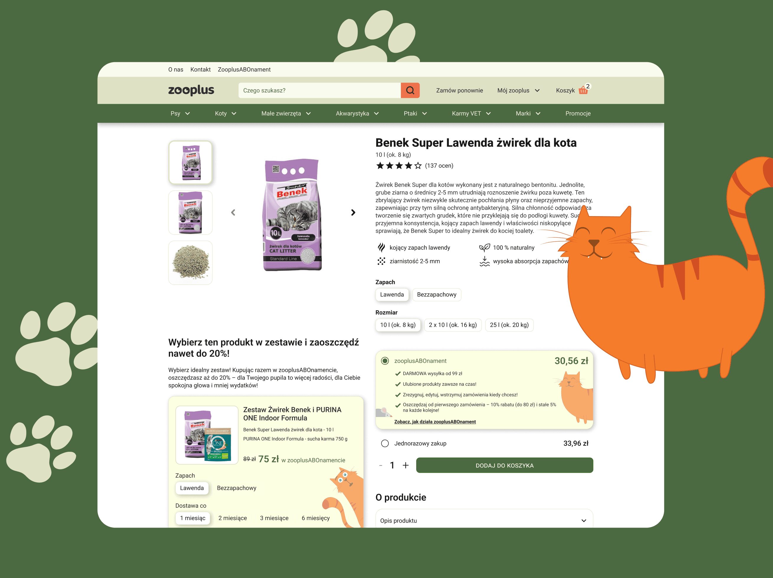
Product Listing Page - redesigned to improve conversions
Finally, I gathered all the above suggestions and redesign the product page to increase conversions, showcase the subscription feature and highlight cross-selling options. I also decided to tone down the colors a little, so that the user could focus on the content without any disruptions, and to make sure the WCAG standards are met.
Before

After

What I've learnt
When I first looked at homepage and product listing page, I thought that there won't be much to improve - I was expecting obvious elements that screem 'UX mistake', but after a closer look I realized it's in the nuances and little details. Together they add up and shape the user's experience, that's why it's so important for me to stay detail oriented and inquisitive.
It was my first attempt at creating icons in Figma from the scratch - it turned out to be more difficult than I expected, but I wish to improve my skills in this area
It doesn't require lot's of redesigning, developers' time or resources to make big improvements. Sometimes replacing text on the banners, changing the order of elements or changing a color are enough to make a difference.