A redesign to win back users
Reviving Last.fm
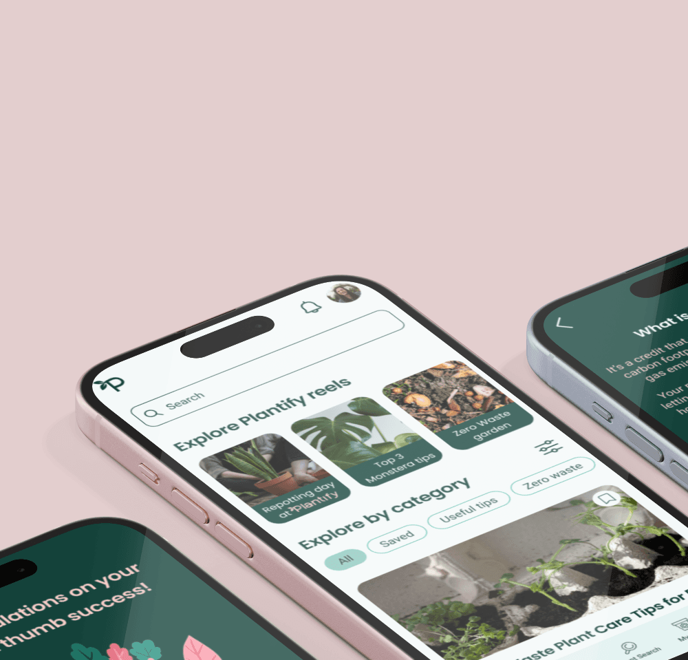
I redesigned last.fm platform to improve usability and bring back users' interest in the platform. The new design provides track network showing where a song was sampled and used in pop culture.
My roles
UX researcher UX/UI designer
Timeframe
Nov-Dec 2023
Team
Individual project
Tools used
Figma Asana
TL;DR
Last.fm offers personalized music recommendations. It lost it's popularity when streaming platforms like Spotify became more popular. My goal was to bring the users back.
Last.fm holds untapped potential. It could offer many unique features with the data it currently has, like offering regular taste summaries, creating a song network where users could learn if the song was covered or sampled, when it was released, or where it was used in pop culture.
The interface is outdated and hard to use. My redesign focused on making it more modern, simplifying navigation, making important data easier to find and more readable (among others by meeting WCAG 2.1 level AA standards)
To make the platform more appealing to former users, I introduced new features like song network, music charts in user's overview, connecting with 3rd party applications, like Strava, personalized banners with live events and new releases recommendations, personalized background and showcasing playlists.


The idea behind the project
Last.fm is not popular anymore
Last.fm is a music platform that allows users to showcase they music taste, discover music recommendations, find information about live events and trending artists. It is a data-driven platform that contains various reports and charts based on users’ listening history. Last.fm was a go-to music discovery platform in the 2010s, but streaming giants overshadowed it, leaving only a dedicated niche community.
How to make it popular again?
Make Last.fm an all-in-one platform, where users can get recommendations, music summaries similar to Spotify Wrapped frequently, find song’s lyrics, as well as song connections. Last.fm should provide exciting new features that would distinguish Last.fm among other music platforms.
Other problems
The features that Last.fm offers are not unique anymore. Streaming platforms have them too.
The layout is outdated, doesn't always meet accessibility standards
Navigation is difficult and complicated
Solutions
Add features like song network showing how songs were covered, where they were featured
Provide fresh design that meets WCAG level AA standards
Provide easy, intuitive user flows, simple navigation
What's wrong with Last.fm?
I started by analyzing current Last.fm page and app to see the areas for improvement. - The interface is quite outdated - Many users switched to Spotify and Tidal, as they can get personalized music recommendations there as well - WCAG standards are not always met - It holds untapped potential - it could provide information not available in streaming platforms


Where did the users go? Taking a look at competitors
My next step was taking a closer look at the streaming platforms that users chose over Last.fm. I focused on Spotify and Tidal, as they are the most popular. I wanted to see what makes them so appealing, and what are the opportunities for Last.fm to stand out.
Music taste summaries available only once a year
Last.fm has the data to provide them more often
Limited information about music and artists available
Last.fm can be a knowledge base about artists and particular tracks
Getting to know the users
Having the goal of bringing back old users to the platform, I spoke to 5 ex-users and asked why they left, what their needs and pain points are. This resulted in listing user goals and struggles that I later addressed with my designs.
Users' struggles
Last.fm doesn’t offer any extraordinary features, so users replaced it with streaming platforms
When searching for music information, you need to visit few different websites
It’s hard to find music recommendations if your taste is outside of mainstream
Modern music is full of samples and interpolations - it’s hard to find where they’re taken from originally
Users' goals
Showcase personal music taste
See music summaries often
Have personalized music charts
Have personalized recommendations based on user’s listening history
See tour dates easily - in a clear way, without being limited to particular location
Have a place dedicated to showcasing the activities they are proud of (e.g. Strava workouts, Spotify playlists, best scores in music quizzes. Many users don’t want to share everything in their social media accounts)
Expand knowledge about music
Share custom made playlists with others
Connect with people with similar music taste
Now how do I bring the users back?
I began ideating by getting inspired by two things I love the most about music: the 80s and live events.


This was my visual inspiration to create a tasteful, appealing interface that gives music vibe.
I brainstormed the features that could possibly answer users’ needs and solve their problems in a way that would make Last.fm stand out among streaming platforms, so that users could be tempted to start using it again.
Staying organized and focused - project guidelines
To gather all these thoughts, conclusions and ideas I came up with project guidelines.
Guidelines
Create a track network
To make Last.fm stand out and offer more than streaming platforms
Provide modern, consistent, accessible UI
To allow more users to use the platform, make Last.fm more appealing
Make Last.fm an all-in-one platform
To retain users within the platform when they want to find music related information
Display music charts in user’s profile overview
Use the fact that users love music summaries and charts, highlight it more
Enable connection with 3rd party applications
To allow users to showcase their achievements from other apps, make Last.fm more interactive
Making Last.fm more usable - UX design
Clearer, simplified navigation
Before

Tab names are quite enigmatic, especially Live and Features. “Live” is in fact trending music, while “Features” is in fact a news page.
The nav bar does not show where the user is - the tab isn’t highlighted in any way.
“Live” is in fact homepage before log in, but it doesn’t clearly say so, it’s a bit confusing, because after logging in there is a separate tab for homepage.
User can access the same pages in a few different ways in the navigation. The problem is they have different names, which is confusing.
After

Reduced number of tabs in navigation bar to avoid confusion and feeling of being overwhelmed.
Current tab clearly distinguished.
The content of tabs originally called “Music” and “Features” combined in Discover section, where users can discover new music and read latest news.
The content of tab “Live” moved to Charts section, where user can see trending artists and songs.
Hero section made bigger, clearer and customizable
Before

Profile menu seems a bit crowded, some tabs could easily be merged together
Text is illegible, on many pictures the contrast doesn’t meet WCAG standards
Hero image is very narrow, the user cannot update it (by default it’s a picture of top track’s author), it cannot be cropped differently
After

To reduce number of items in the menu, some tabs were merged (Following, Followers, Shouts and Neighbors are now “Friends”, as all community related subjects. Loved Tracks, Obsessions and Tags are now under “Library” as all subjects related to Music Library, Events are moved and highlighted in a different section)
Thanks to a dark gradient, the text is readable on every customized background.
More personalization thanks to bigger hero image that users can edit themselves.
Since many Last.fm users are music critics, or aspire to be one, there is a “Reviews” section with user’s reviews of live events, albums etc.
The events section: highlighted and displayed in a clearer way
Before


Events tab hidden deeply in user’s profile
Events displayed in a list-view only
After

Events section highlighted and visible in user’s profile overview
Events marked on a calendar and available in list-view below
Enhancing the charts vibe: top albums
Before

The order of top albums is not clear without having a closer look at the number of plays
The grid with album covers seems a bit crowded and overwhelming
Some names are illegible, depending on the cover
After

Top albums clearly labeled with a number
A carousel view is used to avoid overcrowding of the space, and to allow bigger and clearer view of top albums
Usage of separate cards allows better readability of text, as well as easy navigation to album. Users can also like it or listen to it right away.


Of course there is a mobile version!
Getting there
It wasn’t always easy, especially that it was my first serious project. Although with hindsight I see the design is still imperfect, it took me several iterations to achieve the final one.
Making navigation bar more usable


From dark green icon that looks good on a pink background, but not so good on dark blue, and that floating search button (what was I thinking?) to a neat, organized nav bar with clearly visible active tab.
I made sure the contrast ratio of colors used meets WCAG AA level requirements, to ensure availability to a bigger group of users. I ended up placing the search button in the nav bar as well, as the search function was not intended to be the most important one, so it doesn’t require to be highlighted that much, plus it was covering part of the interface making it hard to read the information below it without having to scroll up.
When can you call the project successful?
I’m aware that a new interface is not everything, especially that the goal was to bring back ex-users to the platform. Here are a few ideas on how to measure if the redesign was successful or not:
Usability testing: ask the user to perform the same task (e.g. find the lyrics of currently playing song) on old and new version, compare times - see if it really is faster on new interface.
Measure number of log ins, password reminders (increased password reminder actions could mean old users are returning).
Measure average session duration together with actions (page depth) per visit. More time spent, together with more actions, could mean thar users engage more with the platform.
Set up goals in web analytics platforms for user actions like:
customizing background image
connecting 3rd party applications
adding playlists
…and see how popular these features are.
Measure time spent on song page and interactions there - see heatmaps in Hotjar or Matomo analytics
See traffic flow - especially what happens after user lands on the song page. It can be easily seen by a phrase in the URL. Do the users bounce, and leave this page? Or do they interact with it, or dig deeper into other pages?
Lessons for future me
What would I do differently next time:
I’d give the UX design more thought, time and priority. Since my bootcamp focused mainly on UI, back when I was working on this project, I didn’t know how to build wireframes and how helpful they are. Now I’d make sure the information architecture, user flows and wireframes are top notch, then I’d move to working on the interface.
I’d use bigger spacings between various elements in my design.
I’d use color sets that contrast more, and I would use different shades of primary, secondary and tertiary colors instead of trying to figure them out manually. It was difficult to create different states of buttons and icons that would all meet WCAG standards.